Kohl's Intranet Redesign
An internal communication tool for 40,000 Kohl's Associates.
UX Strategy & Design — November 2016 to July 2017 — Huge, Inc.

THE ASK
Create a world-class internal communications platform that Kohl’s Associates will love — one that drives engagement and builds a culture of transparency.
Kohl's ask was ambitious: remove the silos and create one new, streamlined digital experience that all will help Kohl’s Associates get their work done and stay informed. The new Intranet should empower Associates within the organization and foster a culture of information sharing, dialogue, and collaboration.
The redesign of Kohl’s Intranet was part of their multi-year Greatness Agenda. A new, easy-to-use, and personalized intranet would create a more connected Kohl’s community. It was one of the many internal initiatives that comprised the company’s strategic goals.
Kohl’s business objectives focused on —
- Delivering employee engagement in the 90th percentile by activating 140,000 passionate, motivated brand ambassadors
- Building a culture of transparency through information sharing, collaboration, and two way dialogue
Activities I was involved in:
- IA & Sitemaps
- Tree Testing the Navigation
- Feature Prioritization
- Wireframing
- Visual Design
- Usability Testing
- Visual QA
MY ROLE
Experience Lead — I led an experience design team consisting of a UX designer and two visual designers through an agile detailed wireframes & designs phase. I created high-fidelity wireframes as well as presented work to main clients and stakeholders.
Additionally, I worked with our product manager to prioritize features and our tech director to deliver designs for the development team to implement and build.
BEFORE
The Intranet was a library of static content being pushed out to Associates.
There were over 100K pieces of content on Kohl's previous Intranet — however, 97% are pdfs and docs that users downloaded to view.
Pain points included:
- There was no visual hierarchy to help differentiate between interesting stories and action items.
- No forum existed for Associates to build a community, celebrate department successes, or learn from one another.
- The content wasn't personalized to Associates needs, interests, role, or department.
- Not mobile-optimized or responsive. Associates were not able to access the site on mobile or outside of the Kohl’s network.
- Content searching, creation, and development was too time consuming. Search was among the top 3 pages visited on both sites, but it was the most frustrating and broken experience for users.
““Stuff is all over the place. There is no place to see what events are happening and I want to volunteer for.””
THE APPROACH
Evolve the current intranet to be indispensable, efficient, intuitive, and truly connected.
A dynamic platform surfacing news, department updates, office information, and social activity — tailored to each Associate.
Our Experience focused on:
- Quick and immediate access to key information across all facets of an employee’s work life
- Providing a holistic, 360 degree snapshot of the Associate's work day
- Creating a central gathering point for user relevant data and information, aggregated from variety of sources via API integration
INFORMATION ARCHITECTURE
We merged Kohl's two distinct Intranets into one experience that flexes based on the Associate's role.
We saw duplicative content and resources across the two Intranets. This was difficult for Kohl’s to maintain and frustrating for users to find current, up-to-date content. We restructured the site navigation, surfacing important content via mega-navigation dropdowns. Most importantly, instead of surfacing all content to all users, Associates only see the menu items that are relevant to their department, store or workplace.
MODULAR DESIGN
A dynamic, personalized, and modular card system became the foundation of the new Kohl's Intranet design.
On the homepage, content is surfaced based on the Associate's department, store and/or workplace, allowing each user to truly feel that the new Intranet was their space within Kohl’s. Jump links on the left-hand size allow for quicker access to the categories relevant to their workflow.
Mobile Prototype
PERSISTENT TOOLBAR
Utility within reach on every page.
We discovered that Associates routinely reference specific resources on the Intranet or launch the same Applications. With this insight, we designed a Toolbar that gives Associates quick access to tools and resources in one consistent place. The toolbar scales across device sizes and collapses to take up less space on smaller screens.
ROBUST SEARCH
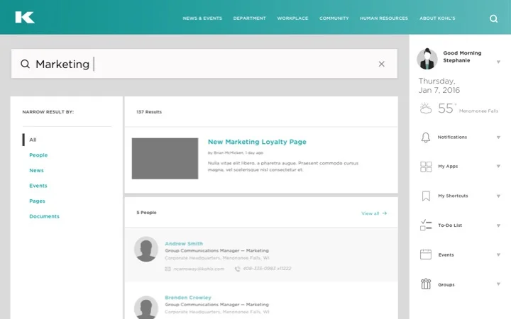
Faceted search provided structure to help Associates quickly find content.
Prior to the redesign, the Intranet site search was broken. In the new experience, publishers tag all uploaded content with relevant keywords, making it immensely easier for Associates to find the information or resources. Curated quicklinks, recent searches, and predictive search all work together to make search on the new Intranet a valuable tool.
Kohl's new Intranet designs
Explore how the design system flexes on tablet.
We used this Invision prototype with visual designs to test with Kohl's Corporate Associates.


